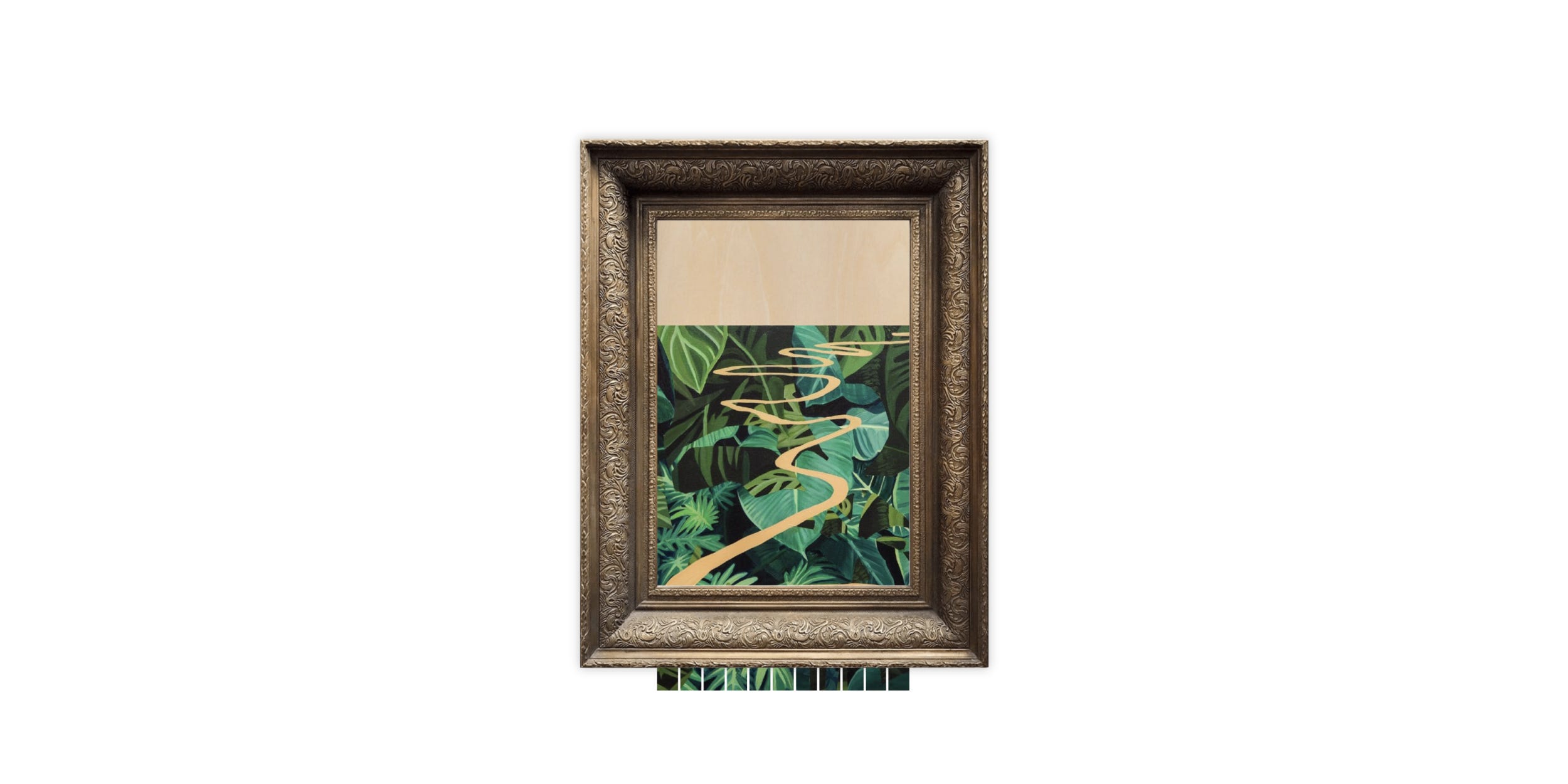
How to Recreate the Banksy Artwork Shredder Using CSS Grid
CodePen included

On Friday, Banksy pranked the world again by shredding “Girl With Balloon” immediately after it fetched $1.4 million in auction. While everyone debates if the artwork has gone up or down in value because of this, I thought it would be fun to recreate the effect in CodePen.IO using CSS Grid. You can check out the outcome of my one hour freestyle session on CodePen and continue reading for a quick overview on my approach.
I wasn’t shy to create a bunch of elements on this rough solution so I piled on a series of divs mostly positioned absolute and then centered the parent element #piece in the middle of the page.
<div id="piece">
  <div id="window">
    <div id="painting">
      <div id="shredded">
        <div class="shred"></div>
        <div class="shred"></div>
        <div class="shred"></div>
        <div class="shred"></div>
        <div class="shred"></div>
        <div class="shred"></div>
        <div class="shred"></div>
        <div class="shred"></div>
        <div class="shred"></div>
        <div class="shred"></div>
        <div class="shred"></div>
      </div>
      <div id="original"></div>
    </div>
  </div>
  <div id="frame"></div>
</div>
Directly within #piece are two divs: #window and #frame. #frame is simply a 100% x 100% artwork frame image we’ll position on top of everything. The #window is positioned below and is also centered within the #piece. This #window holds our #painting div which includes both the #original and #shredded image. The real magic occurs within #shredded via a series of .shred divs which we’ll use a combination of background-image and CSS grid to create shredded versions of our artwork image. Each .shred positions the background slightly to the left.
#shredded{
  background: url(ARTWORK_URL);
  bottom: 0;
  display: grid;
  grid-column-gap: 3px;
  grid-template-columns: repeat(11, 1fr);
  position: absolute;
}#shredded .shred:nth-child(1){ background-position: 0% 0%; }
#shredded .shred:nth-child(2){ background-position: 10% 0%; }
#shredded .shred:nth-child(3){ background-position: 20% 0%; }
#shredded .shred:nth-child(4){ background-position: 30% 0%; }
#shredded .shred:nth-child(5){ background-position: 40% 0%; }
#shredded .shred:nth-child(6){ background-position: 50% 0%; }
#shredded .shred:nth-child(7){ background-position: 60% 0%; }
#shredded .shred:nth-child(8){ background-position: 70% 0%; }
#shredded .shred:nth-child(9){ background-position: 80% 0%; }
#shredded .shred:nth-child(10){ background-position: 90% 0%; }
#shredded .shred:nth-child(11){ background-position: 100% 0%; }
My hacky solution then slides the entire #painting down using translateY while also resizing the #original artwork’s height to 0. Since the #original div is positioned on top of #shredded and #shredded is positioned to the bottom, subtracting its height reveals the shredded image below. You can very easily accomplish these animations directly in CSS. However, I decided to throw in Anime.JS so I had a bit more control on stopping and resetting the animation since I knew I was going to add the ability to change the image. Here’s how Anime.JS makes easy work of the animations:
anime({
  targets: '#original',
  height: 0,
  duration: 100000,
  easing: 'linear'
})anime({
  targets: '#painting',
  translateY: '100%'
  duration: 100000,
  easing: 'linear'
})
And that’s about it. You can dig into the rest of the CodePen to see how I wired up the ability to change the image using Vue and Blue Imp’s excellent Javascript Load Image library.
This was a one hour hack so I’m sure readers will have a much more elegant solution in mind. Did someone say linear gradients? I would love to hear how you would do it and what sort of enhancements you might make. Happy shredding!
